For this weeks task, I created a brief around what a client requested. The brief focused on designing a wine bottle for the company ‘Wanaka Wines’ and it needed to be suitable to audiences in New Zealand and Japan.
Step One: Planning Ideas
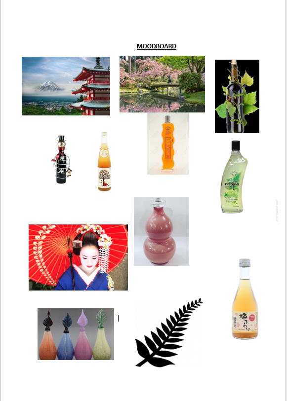
- The first step that I took was creating a moodboard to gather some ideas together. I researched different bottle designs as I wanted to make my bottle to have an original style as that would be it’s unique selling point.
- After researching both Japan and New Zealand I noticed that a common similarity between them was the nature and floral patterns so I decided to make that a key element in my design.
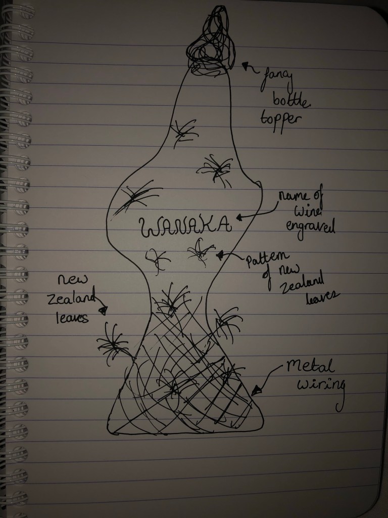
- As part of the planning process I then had to sketch out a design.
Step Two: Designing the ideas
- After I had planned an idea of what I wanted to do, I then broke down my idea into different segments.
- First, I used photoshop to morph a wine bottle into the shape that I was thinking of.
- I then used Adobe Colour to find two colours that I liked; one for the white wine and one for the red wine.
- Next, I found a pattern that I wanted to cover the bottle and found an image of some wiring that I envisioned to go around the bottom of the bottle.
- Finally, I searched for a font using dafont.com and I found one called ‘VTKS wine label’ ; I chose this one because I liked the swirly design to it and I felt that it fitted with the rest of the bottle style.
Step Three: Creating a digital version
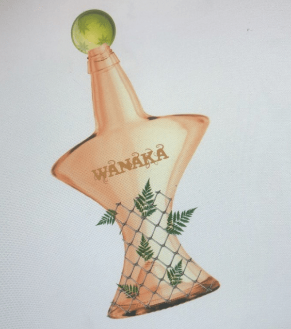
- For the final part of this assignment I bought all of the segments of my design together and attempted to design the full bottle.
- To do this I used Adobe Photoshop, I found a transparent wine bottle online but then edited it using the warp tool to change it into the shape that I wanted.
- The rest was fairly simple as all I had to do was change the colour to the one I wanted and added the text and the other features (the wiring, the leaves and the bottle topper).