*Blog update for my Image Creation module.
The first task that I was set was creating my own wordpress account (evidently I have accomplished that much). This blog focuses on how I set up my blog page and covers some of the basic first steps that I did to set it up that you can also follow.
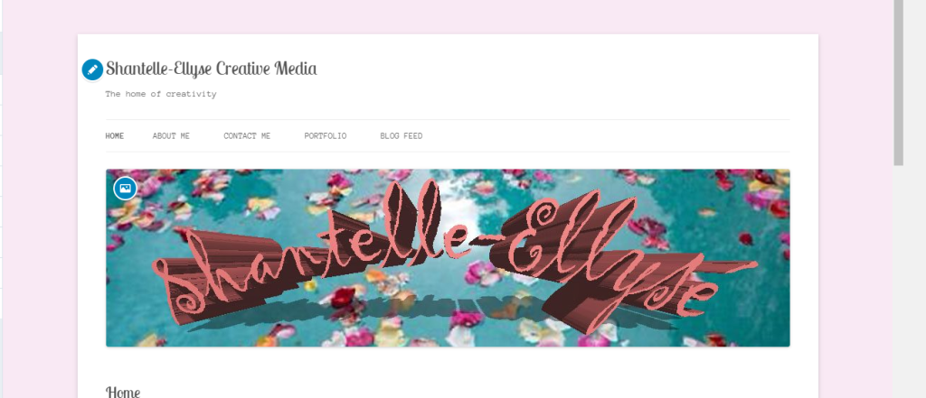
- The photo above shows the current state of my blog page. When coming up with a name for it I decided to go with something pretty self explanatory ; taking my name and then adding the subject that I study at the end of it (very original I know BUT it stops any confusion). Secondly, I needed a tagline/slogan so again I kept it simple and decided on ‘The home of creativity’ – although it sounds slightly cliche and a little cheesy , the message behind it indicates how this medium is where I am able to share any and all of my creative tasks/ideas.
- The next step after coming up with a name and a tagline was putting in place some content management systems. It sounds more complicated than it actually is because it’s just a fancy technical way of saying that I created different pages for different aspects of my blog. Again, the picture above shows the different pages being ‘Home’ , ‘About me’ , ‘Contact me’, ‘Portfolio’ and ‘Blog Feed’. These are fairly standard categories but it is all that you need for a basic and easy setup, as you develop your blog and get to know it better you are able to change, edit, delete and create new pages that feature whatever it is that you want.

- The final part of this post is about designing a header. The header is what goes at the top of your blog page and you can design it to look however you want it too. I found that using Adobe Photoshop was the best way to create what I wanted, admittedly Photoshop is a bit tricky to use at first when your just getting to know how each of the tools work but once you understand them it makes creating a masterpiece so much easier.
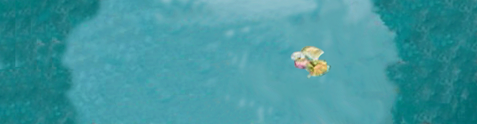
- The background of my header was an image that I had found on google, I liked the idea of the lake with petals floating in it and I really liked the aesthetic of it. As part of the header obviously I wanted to include my name because it’s my blog and I went through different colour tones until I found this dusty pink tone that fitted perfectly with the background.
- Next was deciding the font, I felt like the style I was going for was quite free natured so that is why I decided on using a cursive font but it looked a bit bland in it’s regular 2D shape so I experimented with using 3D (pictured above). After putting it through the 3D setting I felt that it gave the header a new burst of energy which is exactly what I wanted and it made the writing stand out against the background.
- As you can see from the image above, the writing has an arch shape too it which I tested out on it unintentionally but it ended up being the characteristic that was missing all along. I quite like the arch shape because from some perspectives you can see it as being shaped like a bridge over the water and there is a nice little reflection created as well which I feel makes it quite pretty to look at.
THE NEXT POST IS ALL ABOUT LEARNING HOW TO START ANIMATING YOUR IMAGES!
