Category Archives: Media Tutorials

Task 05 – How to create a 3D logo

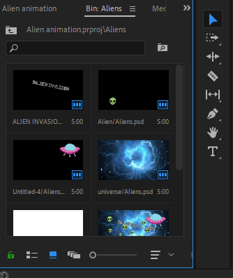
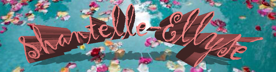
Welcome back! In this tutorial I will be explaining how to create a logo in 3D. The programmes that I recommend using for this are Adobe Illustrator and Cinema 4D. I have chosen to take the header that I previously created and decided to make that into my logo.

Part One:

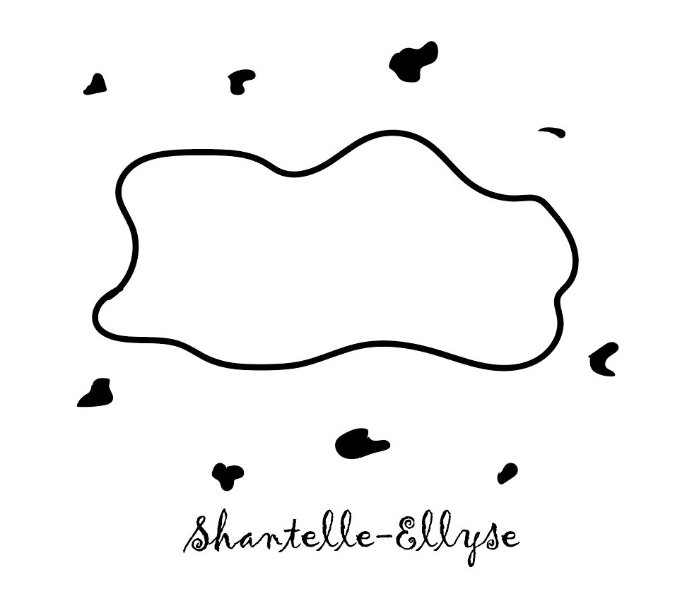
-To start with I used Adobe Illustrator to draw the different segments of my design, it is important to make sure that all of your design is separated from each other – as you can see below in my design the writing and the petal drawings are outside of the squiggly box that I drew. I drew the box and the petals using the paintbrush tool.

-Also, a very important part here is to make sure that all items have a black fill colour and NO outline (if you want your logo to be colourful do not worry as this step comes later on in the process).

-Then finally, save your design and include ’88’ at the end of the file name and make sure you change it to the correct version of ‘Illustrator 8’ before continuing.

Logo design on Illustrator.

Part Two:

-After you have finished on illustrator, you then want to open up Cinema 4D and then go into your files and drag and drop your illustrator file into the workspace.

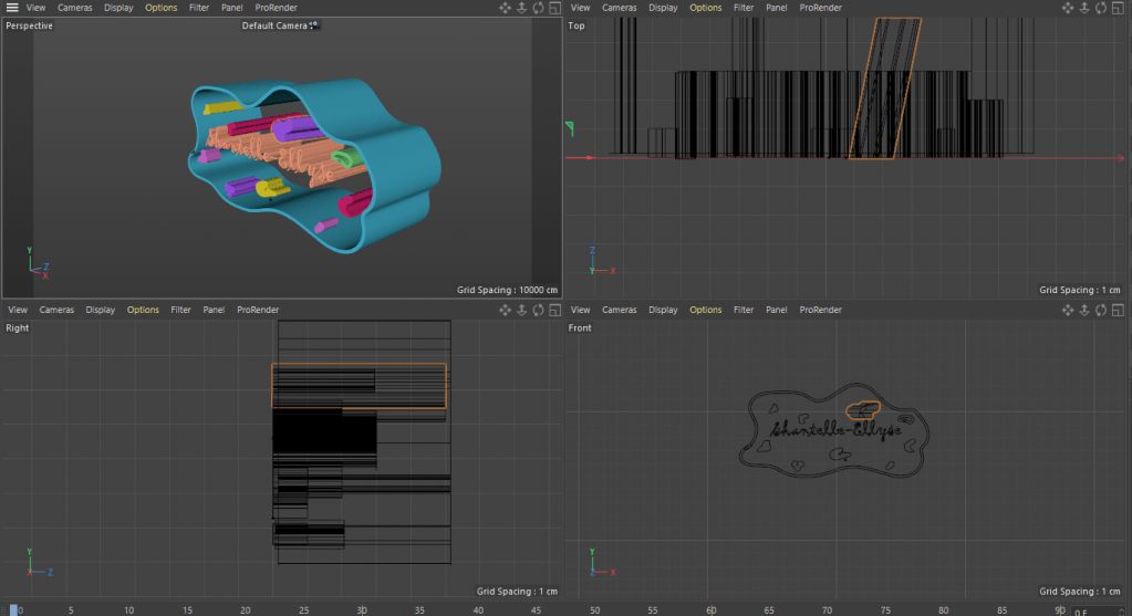
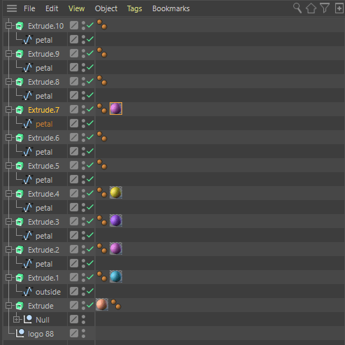
-All of the layers of your work will then appear at the side and here you are able to group together any items that you want to be together, for example I wanted the petals to be together so I held down the shift key and selected every item that was a petal, then clicked object and group together. To make things easier renaming each item will help a lot because then you will know what is what.

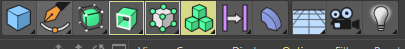
-The next step is to make it all 3D, to do this select an item and then select the extrude button: this is the button that looks like three cubes stacked on top of each other and is in the tool bar at the top of the page.

The extrude button.

-The extruding is what makes it 3D and for it to work on each item you need to drag the item under where you have created an extrude. The picture below shows what this should look like.

  • Now is the time when we get to add colour to the logo. In the image above you can notice how next to some of the Extrude panels is a ball of colour – that signifies that that object is now that colour. Then in the image below you can see how this takes effect on the image as you can see how some segments are now coloured but the remaining grey parts have yet to be coloured.
  • To add the colour, you click on the create button and then select ‘new material’ , then you adjust the RGB values to the colour that you want , then once you have perfected your colour you drag it next to the item that you want to be that colour and then it changes it.
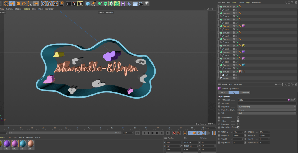
  • The final thing that I did was adjust the sizes of the items so as that they were similar lengths, however with my design it has a wavey feel to it so it wasn’t such a bad thing for them to be slightly out of proportion.

Task 04 – Creating an Image for a Quote

Welcome back readers! This weeks task focuses on picking a quote and then creating an image using photoshop that represents the chosen quote.

Part One: Planning

  • Firstly, I needed to pick a quote. The quote that I chose was “I can’t believe the news today/I can’t close my eyes and make it go away” – these are lyrics from the song ‘Sunday,Bloody Sunday’ by U2.
  • My initial thoughts when I looked at the quote was that I wanted to capture the emotion of somebody but have them surrounded by a bunch of televisions that were playing the news , then I envisioned the background being designed in a way that a TV looks when it loses signal. As I was thinking of this, I sketched it out to get a better idea of what the composition would be like.
My initial sketch.

Part Two: Designing

  • To create my image I used Adobe Photoshop and then I used google to find PNG’s of images that I wanted to include.
  • I found the shape of a TV that I liked the style of so that was the first thing that I imported, originally I thought about having the TV’s cover the background so that is how I positioned them.
  • Of course I wanted the TV screens to look like the news so I got an image of ‘breaking news’ and scaled it down to fit inside the TV screens.
  • Next, was finding an image of a person that conveyed the emotion that I was looking for.
  • Pictured below is the image that I decided to use, as you can see it has a blueish/grey background which I wanted to get rid of. To do this I opened the layer separately, then I selected the ‘select and mask’ option.
  • Then where the transparency option is I increased that all the way up to 100%.
  • Underneath output settings , I selected decontaminate colours and then selected output to ‘new layer with layer mask’ and clicked okay which then cut out the face of the person from the background.
  • Once I had all the items for my image I then had to position it all together.
  • In the end, I decided that I wanted the breaking news signs to be framing the woman as I felt that would focus more in on her facial features. I also added the static in as the background, to make the arrangement correct I simply just swapped the order of the assets which is in the bottom right of the screen.
  • The final step to complete my image was adding in the actual quote, the typography is very important here for conveying the right emotion. The font that I selected was Mongolian Baiti as I felt that it looked quite serious and factual which fitted the mood of the image. I also chose to make the colour grey as it has quite a sombre feel to it.
  • I chose to position the text on the woman’s cheek because I felt that it represented a person crying as tears go down a persons cheek and I felt the words of the quote were symbolic of how a person that is crying would be feeling.
  • There is quite a contrast between the breaking news part of the image to the rest of it because it is so bright, however I feel that this works as it implies how alarming the news is and how much of an impact it has on the persons life as they are fading away into a dull background.
The final image.

Task 03 – How to create a motion graphic

The motion graphic that I created.

Welcome back readers! Today is a rather exciting blog as I am going to teach you how to make a motion graphic, this is actually really cool to do and up above I have posted a clip of the graphic that I created so you can have a quick look at that to see what the final product is supposed to look like at the end of the tutorial!

Step One: Adobe Illustrator

The first part of the process for me was creating each object on Adobe Illustrator, this step can be optional depending on whether or not you want to use your own artwork or if you want to use images for google (in which case you can skip to part 2 and begin from Adobe Photoshop). For me I really enjoy using Illustrator so what I did was I found an image on google of what I wanted , for example the UFO cartoon, and then using the Pen Tool I drew around each segment of it and then used the colour dropper tool to match the colours and then I managed to make the image that I wanted. I proceeded to then also do this with the aliens that I wanted to feature as well. Once you have created your design, delete the google image that you were tracing so you only have your copy on screen and then you want to go to the bar at the top , select ‘view’ and then select ‘transparency grid’. This will make the background transparent so then it will only be the artwork that gets exported. Finally, save your image and get ready for the next step.

Creating each object in Illustrator.

Step Two: Adobe Photoshop

Creating the Image in Photoshop.

In this part, you are basically collating all of your images together on Adobe Photoshop to create the vision of what you want the overall thing to look like. The background image of mine is something that I got from google but then the UFO and the aliens are all what I created on Illustrator and dragged onto Photoshop. I wanted to include some text as well so I used Dafont.com to find a font that would match the style that I was going for, thus ‘Alien Invasion’ was designed. Also, whilst putting it all together on photoshop make sure that each item is its own individual layer as this is important for the final step.

Step Three: Adobe Premier Pro

The final part (AKA the most important part) is where all the magic happens as here is where we take the graphic and add the motion. The programme that I used for this part is Adobe Premier Pro which is really good for editing and making videos. The first thing that you want to do is import your Photoshop file and then when it asks you about layers, make sure to select the option that separates the layers. Your screen will be split into about four different sections but you can adjust the size of each section depending on which part you are focusing on.

In the bottom left corner of the screen will be each item from the Photoshop file that you have imported and you can then drag each item separately onto the timeline in whatever order you want. To keep things simple, drag each item onto a different line so then you can focus on each one easier. From here you can then select each clip and adjust the length of it for however long you want it to last on the screen. In the screenshot below you can see the simple timeline that I created.

Making the timeline on Premier.

Adjusting the videos on the timeline enables a simple motion graphic but to make it more exciting you can play around with different effects on each clip to edit the movement. If you select a clip and then select ‘effect controls’ which is on the upper left of the screen you can then change things such as the position, scale and rotation. You need to actually click on the words (as you can see in the screenshot below they are blue as I have selected them which means that the changes you make will actually work).

Using the effect controls to move the items around.

Then if you notice the blue line going down the screen that indicates the point in the video that the clip is at. If you move the blue line then on the right side of the screen you will also see the video moving. Place the blue line where you want it and then proceed to make your effect changes, for instance if you hover over the numbers next to position and then either increase or decrease them then it will move the item horizontally and/or vertically. It then leaves a small diamond so you can see where effects have been inputted. You can then press the play button and see if you like it or not, if you don’t you can simply delete the effect that you added by selecting the diamond and pressing the backspace button on the keyboard. All you need to do is repeat this over for any other effects that you want on the clips and then you will have created your motion graphic.

Task 02 – Animating a Header Tutorial

*Blog update for my Image Creation module.

  • Welcome back readers! So my last post focused on creating a header which is featured above but today I am going to teach you step by step how you can be more adventurous with your designs by animating them. It is quite a confusing concept when you initially try it out for the first time so starting with something simple is the easiest way to go. Firstly, you want to take whatever design/image you have chosen to be your header and open it up in Adobe Photoshop.

To start with you want to be ready to put your image into layers as this is important for when it comes to animating later on , I created my layers by deciding that what I wanted was to use the background of my header and focus on having the petals appear in the water and then have the writing appear later on.

  • Firstly, I turned off the visibility of the writing so then on screen it was only the background image present to work with. If you look at the image above you will notice a small icon in the shape of an eye next to each layer , the eye symbol means that it is visible so if you click on it it will turn off the visibility which is the first step that I took.
  • Secondly, as you can see I have fewer petals visible in the image above. That is because for this step I used the magic wand tool to trace around petals in the original image and then copy and pasted them. This puts the petals into separate layers which is ultimately what you want.
  • Additionally, another important step to take is making the background a plain layer in itself. Notice how all of the petals have been removed in the image , to do this you select the stamp tool and hold down the alt key then using the mouse you gently click down the left button and slowly colour over the sections of the image that you want to remove (in this case the petals) and it is replaced by the colour that you originally clicked on.
  • The final step to bring your animation together is to put it into a timeline , to do this click on ‘window’ which will be along the bar at the top of your screen and then select the timeline option. This will then bring up all of your layers as you can see in the image above.
  • Once you have got the timeline set up it is up to you to change the sequence of events to go however you want it to, so for me I wanted the petals to appear and then disappear simultaneously which is why I adjusted the duration of each frame to go in a canon-logical order.
  • After putting the timeline in the order that you want it to be in all that is left to do is click the play button and watch your animation back to see if you like it and if you don’t then you know how you can change it!

Now you have your animation finished so if you want to use it for anything online like your own WordPress blog then all you have to do is export the file and click the save to web option and make sure the setting has it in the format of a GIF. If you are using it as a header on WordPress like I am then what you need to do when you click on uploading is make sure that you skip the cropping option because if you click crop then it will break the animation and we don’t want that to happen!

Task 01 – Designing a Header and Content Management Systems

*Blog update for my Image Creation module.

The first task that I was set was creating my own wordpress account (evidently I have accomplished that much). This blog focuses on how I set up my blog page and covers some of the basic first steps that I did to set it up that you can also follow.

  • The photo above shows the current state of my blog page. When coming up with a name for it I decided to go with something pretty self explanatory ; taking my name and then adding the subject that I study at the end of it (very original I know BUT it stops any confusion). Secondly, I needed a tagline/slogan so again I kept it simple and decided on ‘The home of creativity’ – although it sounds slightly cliche and a little cheesy , the message behind it indicates how this medium is where I am able to share any and all of my creative tasks/ideas.
  • The next step after coming up with a name and a tagline was putting in place some content management systems. It sounds more complicated than it actually is because it’s just a fancy technical way of saying that I created different pages for different aspects of my blog. Again, the picture above shows the different pages being ‘Home’ , ‘About me’ , ‘Contact me’, ‘Portfolio’ and ‘Blog Feed’. These are fairly standard categories but it is all that you need for a basic and easy setup, as you develop your blog and get to know it better you are able to change, edit, delete and create new pages that feature whatever it is that you want.
  • The final part of this post is about designing a header. The header is what goes at the top of your blog page and you can design it to look however you want it too. I found that using Adobe Photoshop was the best way to create what I wanted, admittedly Photoshop is a bit tricky to use at first when your just getting to know how each of the tools work but once you understand them it makes creating a masterpiece so much easier.
  • The background of my header was an image that I had found on google, I liked the idea of the lake with petals floating in it and I really liked the aesthetic of it. As part of the header obviously I wanted to include my name because it’s my blog and I went through different colour tones until I found this dusty pink tone that fitted perfectly with the background.
  • Next was deciding the font, I felt like the style I was going for was quite free natured so that is why I decided on using a cursive font but it looked a bit bland in it’s regular 2D shape so I experimented with using 3D (pictured above). After putting it through the 3D setting I felt that it gave the header a new burst of energy which is exactly what I wanted and it made the writing stand out against the background.
  • As you can see from the image above, the writing has an arch shape too it which I tested out on it unintentionally but it ended up being the characteristic that was missing all along. I quite like the arch shape because from some perspectives you can see it as being shaped like a bridge over the water and there is a nice little reflection created as well which I feel makes it quite pretty to look at.

THE NEXT POST IS ALL ABOUT LEARNING HOW TO START ANIMATING YOUR IMAGES!